Artist: Yngve Holen

yngve-holen
yngve-holen

yngve-holen

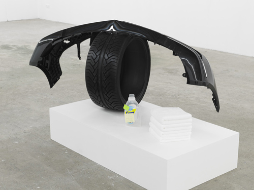
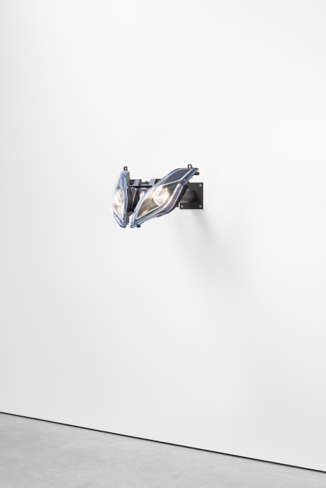
Yngve Holen, Extended Operations, 2013, Sensitive to Detergent, Tired, 2011 and Hater Headlight, 2015

Emerging from the 3D-printed rubble of Berlin’s “post-Internet” art scene, the Norwegian artist Yngve Holen is a cold empiricist and a slapstick comedian. With sculptural test-subjects ranging from minor appliances (tea kettles and washing machines) to high-industrial behemoths (commercial airliners and CT scanners), his works map the anatomical features of a new human-machine eco-system.

René Descartes (1596–1650) had a problem with animals. Or, rather, he had an animal problem. In the Meditations, the “father of modern philosophy” used skepticism to arrive at a radical theory of mind-body dualism. Bodies were machines. Minds were souls. But since the theological doctrines of the time stated that humans were the only animal that could have a soul, it was imperative for Descartes to prove that animals did not have minds either. The French philosopher thus responded by cutting animals open in private and writing about it in public. He penned a number of letters and texts that described animals as deceivingly complicated machines. What appeared to us as signs of their consciousness – their human-like qualities, or their screams under the knife of live dissection – were in fact spring-loaded responses to external stimuli. In the 21st century context, Descartes’s “animals are robots” writings have become the most unpopular of his theories. Perhaps it is because society as a whole has grown to have more empathy towards animals. Or perhaps it is because we know more about machines. Cutting something open to check for its soul seems like lunatic behavior now. At the very least, those of us in this century would use an ultrasound machine first.

In 2011, the artist Yngve Holen (1982–) ran over a chicken with a Toyota RAV4 and 3D-printed its remains. Unlike Descartes’s test subjects, Holen’s chicken was already dead, plucked, and de-clawed. Yet, when he crushed it open, a soul appeared:

Initially, I wanted to scan road kill. But it was difficult to find, and you can’t laser-scan fur. So I got the idea that I’d go to the supermarket and buy a chicken, so I could run it over and scan it. The meat we see in stores is almost a type of design object. For example, a chicken at a supermarket is so far from being a chicken. It’s had its feathers taken out. It’s cut into thighs and wings and drumsticks with lasers at some factory. It undergoes all these sculptural changes in order to transform from chicken to “poultry.” It’s a scary industry. If you don’t buy bio, chicken is cheap as hell. For an artist, it’s cheaper than buying clay. Then, when you drive over it and crush those bones – when you turn it into road kill – it’s suddenly this individual thing again. You give the chicken a soul by running it over. And then you extract that soul by scanning it.

With the artist-publication ETOPS, Holen formed an editorial extension to his sculptural practice. Comprised of long-form interviews with specialists from a variety of occupations, the magazine performs verbal dissection on the routines of otherwise opaque industries. It proffers details that simultaneously augment and drain the fear surrounding professions that operate in the intersections of body and machine. Aptly, the first ETOPS investigated the experience of air travel. In addition to an interview with a commercial pilot, the publication featured camera phone pictures of cruising-altitude sunsets and rows filled with cramped legs.

ETOPS is regulation system in aviation that says how many minutes you can fly a twin-engine aircraft without being in a certain radius of an airport. So a plane will be certified for, say, 120 minutes. Or now some are certified for 720 minutes, so you can basically fly wherever you want. But there’s this pilot joke that ETOPS stands for “Engines Turn, or Passengers Swim.” It’s funny. Metaphorically, it’s a question about how long we can stretch an idea before we crash it. How long are you allowed to spin off certain ideas before it doesn’t fly? The materials can only go for a certain amount of time. After that, the idea can go further, but the materials then won’t allow for it. We tend to think that these thresholds don’t exist, because they keep getting pushed further and further. Like, how far can the body swim before it drowns? We want to know that limit.

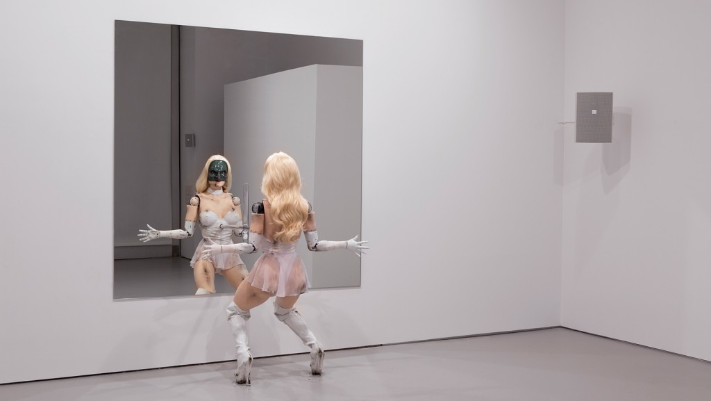
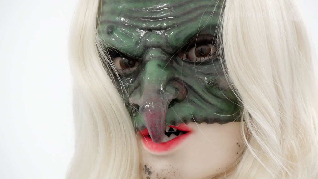
With ETOPS, Holen turns his line of inquiry away from the insides of machines and towards the invisible limits of how far the body can be stretched into something foreign from itself. For the second edition of ETOPS, designed by Per Törnberg, Holen and his editorial partner Matthew Evans travelled to Los Angeles and Monte Carlo to interview members of the pornography and plastic surgery industries. The resulting collection of anonymous interviews provides a look into two fields of practice that blur the distinctions between the natural and the artificial. By discussing the minutia of these occupations, ETOPS provides a textured account of everyday life in a futuristic present. During a dinner conversation, a pornstar gives advice on what to eat before sex scenes. In another interview, a plastic surgeon discusses how the placement of scars has been effected by trend cycles; The aesthetic has changed through the years. What is good-looking now may not have been 10 years ago.

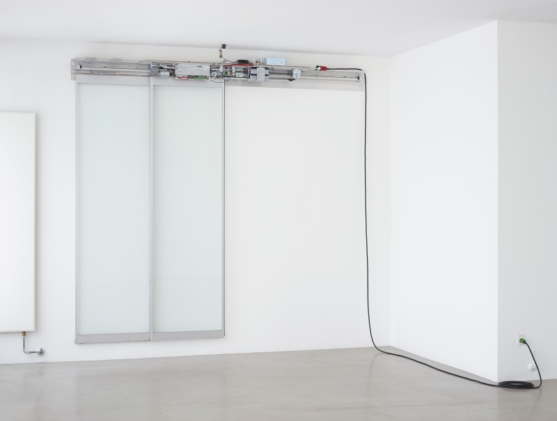
For his solo exhibition “World of Hope” (2015) at Galerie Neu in Berlin, Holen released the second edition of ETOPS alongside a series of works make from the faces of CT scanners, which the artist dressed in custom-fitted fishnet fabric. Unlike the dissected water vessels of Parasaggital Brain, the sculptures allude to the possibility of seeing inside without incision. They present a technology designed to see through skin that is encased inside a fabric designed to see through clothing. Mounted on the wall as a type of relief, the works masquerade as paintings, winking at the Renaissance ideal that a picture should be a “window” into another world. They allude to the limits of the two-dimensional – the blurry and flattened organs that appear in radiology. Their shape suggests a type of industrially-designed orifice, although it is unsure whether it is designed for entrance or exit.

Source: Kunstkritikk.
Text: Thom Bettridge, 032c.
All images belongs to the respective artist and management.

Read Full Article

Artist: Hans Christian Lotz

hans-christian-lotz CA_LOTZ_2015_01-800x605

CA_LOTZ_2015_03-519x700

Hans Christian Lotz, Untitled, 2016, Die Ölmühle aus Bickelsberg im Freilichtmuseum Vogtsbauernhof Gutach, 2015 and Untitled, 2015

In one famous scene in Jacques Tati’s 1958 film Mon Oncle, Tati’s character Monsieur Hulot tries to open the kitchen cabinet in his brother-in-law’s hyper modern suburban home. He pulls repeatedly on the cabinet’s handle, but cannot open it. He accidentally tricks some switch and the doors fly open without warning, comically spilling their contents onto the floor. All throughout the house the doors are automatic; the garage door operates with a mind of its own, the doors to the veranda slide open and closed randomly, and Tati even manages to break the gate to the house as he attempts to use it like the “manual” doors of his apartment in the city.

In the main room of Hans-Christian Lotz’s untitled exhibition at David Lewis Gallery, three sets of glass automatic doors, the kinds characteristic of convenience stores or supermarkets, are mounted to the walls, opening and closing as you walk around the room. The doors, in parts smashed and with their operating mechanisms visible to the eye, at first appear like debris removed from the aftermath of a vicious riot in some European suburb—a much more extreme reaction to the superfluous upper-middle-class posturing that was the subject of Mon Oncle’s satire. But upon closer inspection, the mechanical objects betray that they too are in on the joke. Titled with absurdly long untranslated names of German water-powered mills like “Die Ölmühle aus Bickelsberg im Freilichtmuseum Vogtsbauernhof Gutach” (2014), the pieces are acutely aware of the anxieties of Monsieur Hulot’s trip to suburbia—except, of course, in the past 60 years the automatic door has shifted from a middle-brow extravagance to an immanent, and banal, symbol of commerce. Furthermore, Lotz’s version of Hulot’s trip from the city is not straight to suburbia, but also adds a stop in the bucolic German countryside.

Underscoring this, one set of doors has a folksy flute embedded in its mechanism, while another has a cast facsimile of the flute. These objects, their copies, and the titles of the sculptures (names of mills) all refer to a history of industrial production set between two poles of city and country, and harken back to the pastoral ideals of the German Romantics, where technological advance stood in profane contrast to the ageless magnificence of the countryside. In Lotz’s hands, the sliding automatic doors augur a philosophical collapse of property enabled by technology; emblems of the city, country, and suburb collide into a vague and threatening territory guided purely by economics, existing everywhere and nowhere. His Germanic references fit the works’ intellectual prescriptions.
Walking around the space, your movements triggering the sensors that open and close the pieces, is a disconcerting experience with a lingering air of menace that Tati would have appreciated. It doesn’t feel quite like a gallery, and as the movement of the doors traces your path through the space, you can’t help but be aware of the fact that the work is staring back at you. Of course, for the moment, there is an important difference between a surveillance camera and an electric eye—only one keeps a record.

Source: Artforum.
Text: Alexander Shulan, The Brooklyn Rail.
All images belongs to the respective artist and management.

Read Full Article

Artist: Jordan Wolfson

jordan-wolfson-artistJordan Wolfson Artist

JoWDZSHOW2016_install_01

Jordan Wolfs, Female Figure, 2014 and Colored Sculpture, 2016, Installation View

In a recent interview Jordan Wolfson artist traced a cycle of works produced since 2009 back to a moment of eye-contact: “It is something that became clear to me in Your Napoleon (2009) […]. For that work, I kept trying to figure out how to cut and paste these mock conversations about string theory and pop culture, and it felt like an ad-lib […]. I didn’t come up with the term formal bridge until I basically asked the actors to just read the script and look directly into my eyes, stare deep into my eyes” [Jordan Wolfson and Aram Moshayedi, “Tell a Poser,” in Ecce Homo / le Poseur, Walther König, Cologne, 2013, p. 92].If eye contact is both the semblance of a “truthful” connection and in the right hands a mask for falsity, Wolfson has pursued this “formal bridge” into a realm of heightened artifice and discomforting disclosure. His sophisticated animated constructions have achieved an unerring capacity to meld the giddy “anything goes” of computer-generated imagery with the telling fetish of the pop-cultural meme.

In his first solo exhibition for David Zwirner in New York in 2014, comprising a projected film, an installation and a number of digitally printed reliefs, instances of engineered eye contact between an artwork’s protagonist and the viewer anchored the show. The looped film Raspberry Poser (2012) featured a medley of animated forms layered against stock-image backgrounds and tastefully shot locations, set to a soundtrack of Beyoncé and Mazzy Star. Bouncing HIV virus particles and ethereal floating condoms emitting cascades of love hearts roved the streets and luxury lifestyle boutiques of New York’s SoHo. Meanwhile a generic cartoon boy gleefully strangled and self-eviscerated himself, as if to prove his immortal otherworldliness. Intercut with these characters, a series of live-action sequences showed Wolfson dressed as an archetypal punk on a “dérive” through a Parisian park. A close-up shot sees him turn to the camera and hold the prolonged gaze of the lens, an insouciant smile flickering across his face. The camera, of course, mediates the connection between Wolfson and the viewer. But the intentionality and persistence behind “the look” is unnerving. It holds both an arrogant knowingness and something of the contorted power play of a fashion model’s stare into the camera.

Female Figure 2014 is an almost absurdist endgame for discourse around the theatrics of the sculptural object and the tendency towards stagecraft within the contemporary art exhibition. While the robot’s routine was scripted, programmed and seamlessly looped — not unlike Raspberry Poser playing nearby — the physical nature of the encounter was heightened through the restriction to one or two people entering the room at any time. This conceit, a gesture towards an individualized performance, allowed for the singular experience of being “seen” by “her,” a phenomenon made possible by the use of advanced facial recognition and motion-sensing technology. The robot is the distant figure in the park in Jean Paul Sartre’s Being and Nothingness (1943). Thought of as a puppet, its relation to the objects around it is purely additive; it creates no new relations in the world of the viewer. In its locking of sight-lines, however, the viewer is momentarily yet disconcertingly aware of becoming an object in the eyes of the automaton.

In many regards, Jordan Wolfson artist work embodies the internalized contradictions of a generation whose teenage years spanned the twin poles of a burgeoning hyper-sexualized cultural economy and the media-stoked specter of sexually transmitted disease. In conjuring up a social imaginary around HIV and AIDS activism, Raspberry Poser echoes a young adult asking: “What does it mean about me?” — what writer Sarah Schulman has described as a “suburban narcissism in which one is able to ‘identify’ in order to internalize value”[Sarah Schulman, The Gentrification of the Mind: Witness to a Lost Imagination, University of California Press, Oakland CA, 2012, p. 7]. The “place of distortion” Wolfson moves toward is undoubtedly agonistic, as it rests on a neurotic self-identification that appropriates positions of sexuality, gender, race and class — positions that themselves are present in the work only through inflated, vulgarized stereotypes. “Do you think I’m homosexual? Do you think I’m rich? Will you tell them what it’s like to be with me?” The artist’s needy voice is caught within the performance of a hyperbolized role, a meta-dialogue with the viewer that challenges their presumptions of identity and the “honest” disclosure of inner angst. While Wolfson is evidently not himself the loose-skinned, tired man of the poetic monologue in Female Figure 2014, the psycho-sexual inner world of the creator of the Bellmer-esque robot-as-sex-object looms large as an involuntary fiction.

There is a clear sense in which the artist’s work from 2009 onward has rejected a reliance on acquired methods and signifiers of artistic validity and rectitude. The complex cycle of works that culminates in the twin gazes of the female automaton and the languid punk instead offers witness to an unadorned self-image at odds with the governing techniques of the self-enterprising individual. Wolfson’s adoption of animation and animatronics locates this externalization within structural ambivalence; the ability to warp, inflate, distort and fantasize offers a fitting testimony to the splitting of contemporary subjecthood.

Source: Kunstforum International, June July 2016 Issue.
Text: Richard Birkett, Flashartonline.com.
All images belongs to the respective artist and management.

Read Full Article

Hood By Air Menswear Spring 2017, Paris

hood-by-air-menswear-spring-2017

Hood By Air Menswear Spring 2017, Paris

Hood By Air makes things difficult. These images were shot days after its Spring 2017 show in Paris, a frenzied cruise in semi-darkness through a gay sauna in a seedy part of the Marais that culminated in a synchronized swim in the hammam’s subterranean pool (don’t think: Busby Berkeley). The clothes were glimpsed only in passing, as models pressed against bystanders and then moved along. “We revisit things that people know about HBA here, like logo placement. Because it’s recognizable in the dark,” said Shayne Oliver postshow. “We push newer ideas forward in the light.”

The light he’s talking about is Hood By Air’s biannual shows that are part of New York women’s Fashion Week, staged with increasingly polished production values (and, indeed, lots of lights). While Oliver himself is loath to put labels like menswear or womenswear on his garments, he understands the demands of presenting collections with those market restrictions. Hence the fact his Paris “shows” boycott the runway in favor of atmospheric locales and unconventional formats. “We just want to celebrate Hood By Air in the men’s market,” said Oliver. “When people are reviewing it against something that is very tailored, it feels weird . . . we’re not competing with them.”

So what are these January and July shows all about for Oliver? Research and development, it seems; he talked about the garments acting as the reference for the show to be staged in September, also acknowledging the very real business behind this creativity—that these clothes will drop earlier, satisfying retailers with an advance delivery. Almost like a Hood By Air recollection then, although the ingenious complexity of Oliver’s work couldn’t be further from bland commercialism. There’s something unsettling about what Oliver shows, often with implications of violence in the slicing, mutilated pieces distorting perceptions of the body within. But he saw these looks as a kind of “positive utilitarianism,” also linking to the military theme that ran through the season. Although Oliver’s utility wound up in hospital garb: Rather than garments slicing apart the body in attack, the outfits were centered around healing, with their trusses, bandages, and even built-in leg braces. What was bandage and what was bondage? The contrast between flesh strapped for pleasure and flesh strapped to cure pain was never quite clear. Oliver said these spaces were about relaxation, about a relaxed attitude to sexuality, and an ease with the body. It wound up like a Netflix-and-chill session watching The Texas Chain Saw Massacre, helped by a decibel-shattering soundtrack. It was uncomfortable, but it also pushed us out of our comfort zone.

What Oliver does is exciting because it speaks to people. His fashion seems progressive, difficult even, due to its odd proportions and strange slogans. Do you know where your children are read one, mimicking scare mongering that preoccupied previous generations and hasn’t entirely been shaken off by our own. These clothes are arresting because they’re a product of our times, of a designer plugged into groundswell movements in culture, rejecting the hierarchy and elitism and creating something that resonates. It also satisfies fashion critics who want to be excited, annoyed, and generally provoked by clothes that challenge. Which means that you don’t mind being crammed into a sweaty bathhouse and barely glimpsing fabric and flesh in the gloom. It’s an experience—inconvenient, but interesting.

At least it feels like Oliver is trying to say something new, to find his own voice rather than join the conversation about the tired language of luxury. That doesn’t even feel relevant when you’re talking about these clothes. They’re something else. And in a world where otherness is rapidly co-opted by a voracious fashion system and forced into its pigeonholes, Hood By Air’s steadfast refusal to kowtow to the system is worthy of plaudits.

Source: Vogue.com.
Text: Alexander Fury, Vogue.com.
All images belongs to the respective artist and management.

Read Full Article

Vetements Spring 2017 Ready To Wear, Couture Season Fall 2016, Paris

_VET0137_VET0421
_VET0579

Vetements Spring 2017 Ready To Wear, Couture Season Fall 2016, Paris

The Gvasalia brothers, Demna, the designer, and Guram, the business brains behind the Vetements phenomenon, pulled off a coup for the fashion credibility of Paris with a show in the Galeries Lafayette tonight. On many levels, it was an event which satirically contravened half a dozen arcane regulations of what is supposed to be the correct way for a label to operate. It was a collection made entirely with other brands, including Brioni, Schott, Levi’s, Comme des Garçons Shirt, Reebok, Canada Goose, Dr. Martens, Alpha Industries, Eastpak, Lucchesse, and Manolo Blahnik. It was both women’s and menswear, and it was magnanimously welcomed by the Chambre Syndicale de la Couture as the big ta-da opener of couture week. Yet it was so far from being traditional haute couture that it was shown, cheekily, in a department store—during regular hours, at that.

Twisting the conventions in terms of pre-existing generic garments—hoodies, trench coats, bomber jackets, jeans—is always Demna Gvasalia’s thing, and this was just one giant logical step further along that path. “We thought we’d go straight to the brands who make all these things best, and ask to do something in our way with each one,” he said. “The people who work at Vetements don’t really wear designer fashion—a lot of these are the labels they wear all the time.” The brands, from Mackintosh in Scotland to Lucchesse cowboy boot manufacturers in Texas, were approached by his CEO brother who set the legal and logistical negotiations to do with manufacturing, joint labelling, and selling. The clothes will mostly be made by the individual brands’ own specialist factories. “I’m explaining it to retailers that this is not one collection, but 18, which they will receive in different drops throughout the season.”

The “best in category” collaborations went to a couple of high-level places as well. One was the classic Italian tailoring company Brioni, who agreed to Vetements’s sacrilegious processes of gigantic oversizing, unpressed seams, and fusing linings to cloth with glue. Another was Manolo Blahnik, who was game for going all the way with exaggerating his duchess satin stiletto boots for them. “We’ve done thigh-high, so we asked, could you go waist-high this time for us?” Demna noted. He was also happy to add a personal touch to the Vetements collab by autographing his classic satin pumps in bleach. More difficult, said Guram, was winning permission from Levi’s to have an embossed Vetements stamp on its label: “This has never been allowed before in its history!”

Still: It was drive and the energy with which this collection of collections came together that actually mattered, and especially at the end, when it moved into innovative high fashion gear with Vetements first real dealings with eveningwear. There was a brilliantly subversive “couture” collab with Juicy Couture, using its signature stretch velvet in skin-tight catsuits and incendiarily sexy long skirts, which are slit all the way up to the bottom and are kept on with an internal thong. Finally, there was a series of chic asymmetric dresses in slinky ’70s jersey or chiffon, and then Lotta Volkova Adam, ending the show in this Winter’s new Vetements floral dress, this time with blue flowers on a white background. That, laughed Demna Gvasalia, was “a collaboration with ourselves!”

Source: Vogue.com.
Text: Sarah Mower, Vogue.com.
All images belongs to the respective artist and management.

Read Full Article

Raf Simons Menswear Spring 2017, Florence

_UMB2662
_UMB3853_UMB2627

Raf Simons Menswear Spring 2017, Florence

Earlier this year, the Robert Mapplethorpe Foundation contacted Raf Simons. They asked if he’d like to work with them on something. He said yes. That’s the shorthand version of the story behind the collection he presented at Pitti Immagine Uomo, perfectly chimed with a duo of Mapplethorpe exhibitions at LACMA and the Getty Museum, and the HBO documentary subtitled Look at the Pictures. It was the right time. And Simons is a Mapplethorpe fan, so it was the right artist. “I was honored,” Simons said after his show, his voice vibrating with emotion. Hence he shelved the idea he was working on for a collection (he wouldn’t reveal what it was; it may, he said, come out in a later show) and began his latest artist collaboration.

Normally, when Simons works with an artist, he approaches them. This time, the dynamic had somewhat shifted. The generosity of the Mapplethorpe Foundation’s offer is reflected in the generosity of Simons’s interpretation: There’s no outfit in Simons’s Spring 2017 show that doesn’t feature a photographic print of a Mapplethorpe. His curly-haired male models, with seductively slanted leather biker caps, often bore a striking resemblance to the photographer himself—though Simons stated that, rather than the artist’s doppelgängers, “every boy is a representation of a piece of work.” Each could be a Mapplethorpe sitter. The billowing shirts had shades of Mapplethorpe’s famous muse Patti Smith on her Horses album cover. Robert Sherman, a model whose alopecia made his skin approximate marble in his many portraits shot by Mapplethorpe, also attended the show. Simons had to clear third-party rights with all the sitters before reproducing their images. It began a dialogue that resulted in an immersion on Simons’s part in Mapplethorpe’s work.

That being said, the artist sat for himself a lot. Mapplethorpe was a fascinating character, and the art is inextricable from the man. “If you think about the work, it is so much about him,” said Simons, and, indeed, it was so much about the clothes he wore, too. On a voyage of sexual self-discovery, many of Mapplethorpe’s first pictures were Polaroid self-portraits, trussed up in leather gear, testing the limits of pleasure and pain. Later, he documented his own sexual fetishes; the leather scene and BDSM predominantly. Clothing was a vital component: At one point, Mapplethorpe began stretching his own (worn) underwear across wooden frames to form unconventional sculptures; later, he clad himself in black leather.

Simons knows all of that. Hence the fact his homage to Mapplethorpe felt so thoroughly rounded, so passionate and truthful. The subtlety of Simons’s multiple references gave the show depth—his palette of black; white; the bruised-flesh shades of crimson, pink, and purple; and the burgundy of coagulated blood; the leather dungarees glinting with metallic buckles. Simons spent two afternoons pawing through the Mapplethorpe archives of contact sheets. He struggled with the English terminology to describe those: He called them “maps,” which is a far more interesting and evocative notion when applied to Simons’s search, to find new territory for Mapplethorpe, to make him feel relevant and exciting to a new generation. That’s what he saw his role as.

I’m a Mapplethorpe fan too. I couldn’t help but ally this show to Mapplethorpe’s fascination with frames, with giving his imagery a three-dimensional element, a sculptural quality by framing and matting in plush velvets and exotic woods, attaching imagery to objects. Making his photographs more than they may first appear. Simons framed Mapplethorpe’s images with cloth, but then further framed them on the body: an image printed on a tabard, say, surmounted by the curtains of jacket lapels, or revealed on a T-shirt under a loosely draped sweater. Simons gravitated towards Mapplethorpe’s sexualized images of flowers, his idealized portraits of famous subjects like Debbie Harry, caught in coronas of light, and of artists whom Simons also shares an admiration for, like Alice Neel, captured a week or so before her death in an extraordinary 1984 portrait. Sex was in there, too; Simons was insistent on that. A down-stuffed jacket memorably turned to reveal an image of an erect phallus.

He also used the phrase “curation” to describe this show: “I wanted to approach it like a museum show, or a gallery show. Which has been done very often when it comes to Mapplethorpe’s work. Cindy Sherman did it, David Hockney did it. But always in a gallery.” Simons frowned. “I am a fashion designer. I thought the biggest challenge would be to do it in my own environment.”

The curatorial aspect made for a fascinating notion, especially in a time when so many designers appropriate and reference without credit—and when so many people throw around the verb “curate.” It’s indicative of Simons’s nature—respectful, quiet, intellectually hefty—that he saw this collection not as his creations with Mapplethorpe’s imagery tacked on, but as a collaboration akin to a gallery show, where his role was, at least in part, to best showcase the works he was given. But it was also to use those works to tell a new, exciting, and provocative story. To show us something new from the well known, and much seen, archives of Mapplethorpe. Which he undoubtedly did.

Source: Vogue.com.
Text: Alexander Fury, Vogue.com.
All images belongs to the respective artist and management.

Read Full Article

Gosha Rubchinskiy Menswear Spring 2017 Florence

 _UMB0587 _UMB0871_UMB0603
Gosha Rubchinskiy Menswear Spring 2017, Florence

A change of scenery, a change of pace. The menswear designer invited by Pitti Immagine to stage a show in Florence for Spring 2017 is Gosha Rubchinskiy. Moscow born, based, and somewhat obsessed, his collections thus far have unraveled his Soviet identity, nostalgically harking back to the time before the curtain fell, and immediately after. He’s offered branded sportswear like ersatz ’80s Russian Olympic gear, and reclamations of teenage clubbing attire from the mid-’90s. What would Gosha do in Italy, though?

Firstly, he found “the only Soviet-looking building in Florence,” to borrow the words of his stylist Lotta Volkova—a tobacco factory in the high rationalist style, built in the ’30s and abandoned 15 years ago. Most of the building was derelict, the show staged in a courtyard bordered by stained concrete and smashed windows. It also provided the backdrop for a short film by Renata Litvinova—Rubchinskiy and Volkova also featured. The film was dedicated “To Pier Paolo.”

Pasolini was the key inspiration for Rubchinskiy—the life and death of the man himself, as well as his creative output. He was a communist, for one, which no doubt appealed to Rubchinskiy’s Eastern Bloc fascinations (then again, so was Miuccia Prada). The sly undercurrent of sexuality that is so often evident in Rubchinskiy shows was here more explicit: The first model, bare-chested beneath a loose-cut pinstripe suit, could stand in for Pasolini’s teenage lover Ninetto Davoli, or Pino Pelosi, the 17-year-old hustler who confessed to his murder in 1975.

If Rubchinskiy has referenced generations of Soviet youths in seasons past, these Italian ragazzi felt tied intrinsically to the reality of modern streets Rubchinskiy has contributed heavily to—namely, the streetwear-clad legions of contemporary menswear. The designer showcased multiple collaborations with a veritable closet of historically Italian sportswear labels—Fila, Kappa, and Sergio Tacchini. Each iteration, combining classic elements of the brand with Rubchinskiy’s own signature branding, had the feel of black-market counterfeits. Indeed, it was only after the show (upon inspecting labels, and asking the right people the right questions) that you could ascertain if those Canal Street–style sweatshirts with Fila’s serpentine logo and Gosha’s name stitched below in trademark Cyrillic were real or make-believe. Most plumped for the latter camp. More fool them. There was also a hookup with Levi’s to create Gosha-brand denims and corduroy jackets.

More than any of Rubchinskiy’s other collections, this linked to the idea of a wardrobe: sportswear-focused, sure, but aren’t many people’s entire lives geared up to athletic gear? The standouts in Rubchinskiy’s Italian debut were, surprisingly, the tailored pieces, rounding out his guy’s closet, offering his loyal customers something new, and maybe even securing fresh blood. The opening pinstripe, a pair of double-breasted velvet jackets, cut confidently broad of the body and wide in the shoulder, even had a touch of another leading designer to their swaggering shapes. Giorgio Armani. That’s something you never expected of Gosha. It was certainly something he’d never shown before.

Last season, Rubchinskiy cited the end of a cycle, and the beginning of something new. Perhaps that means a move away from his usual stomping ground, both creatively and physically. The shift to Florence seems to have shifted his creativity. It kicked it up a gear.

Source: Vogue.com.
Text: Alexander Fury, Vogue.com.
All images belongs to the respective artist and management.

Read Full Article

Tim Coppens Menswear, Spring 2017, New York

_AN_3353 _AN_3754 _AN_3393
Tim Coppens Menswear, Spring 2017, New York

Remember clubbing? Do people still do that? You know—roll deep, head to some warehouse where the music is so loud it obliterates all reality, and emerge busted at sunrise to face the city you left behind the night before. That kind of clubbing. Tim Coppens remembers those cockeyed mornings. Their surreal attitude informed his latest collection.

Coppens got at his post-clubbing vibe via a canny mix of sharp geometry and willed ersatz-ness. The geometry was witnessed in the emphasis on grid check and houndstooth, and graphic color-blocking and stripes. The ersatz-ness, meanwhile, was most overt in the collection’s soft shapes, like the blouson bombers for men and women, slouchy trousers and distended shorts and shirtsleeves, but it was also to be found in his clever layered-look outerwear, lightweight coats and anoraks that offered a meticulous reinterpretation of sundry items sloughed over each other willy-nilly. From a purely practical standpoint, the layered-look pieces were a smart proposition—an armored-up, streetwise aesthetic in a format suitable for warm weather.

But Coppens’s most inspired touches here were in his details. There was a lovely poetic quality to the blurred stripe edges on his needle-punched knits, for instance, while his kimono-inspired jet print boasted an intriguing, unexpected tactility, inasmuch as the print had been cut out of the original fabric and re-embossed on houndstooth jackets. These kinds of gestures really captured the tone of bygone comedown mornings—the way the blunt shapes of the streetscape go all watercolor, viewed by bleary eyes; the surprise of sensation returning to dance-numbed extremities. Man, being young was great.

Source: Vogue.com.
Text: Maya Singer, Vogue.com.
All images belongs to the respective artist and management.

Read Full Article